
First Impressions: Why Your Website Might Be Costing You Clients
First Impressions: Why Your Website Might Be Costing You Clients
When we first launched the directory, I added everyone’s profiles for free.
It was one of those turning points that made me dive deep into visibility, not just how to get it, but how easily it can be lost.
Very quickly, I realised that a huge percentage of the industry wasn’t getting even the basics right.
Before I go further, this isn’t a criticism. Most of us didn’t open salons because we dreamed of running businesses, we did it because we were good at what we do. We became business owners almost by accident.
But that’s exactly where the problem lies.
The parts of business that feel less creative, things like websites, SEO, branding, are often pushed to the bottom of the list. Yet those are the things that quietly shape how clients perceive you before you ever meet them.
The professionals who’ve worked with me and taken the time to implement the basics, Google optimisation, professional imagery, and a clean, user-friendly website, consistently see major shifts. Not just in traffic, but in turnover too.
You have less than a second to make a first impression
Studies show it takes about 0.05 seconds for a person to form an opinion about your website (Stanford Web Credibility Research). That’s less than the blink of an eye.
In that tiny window, the human brain is scanning for visual harmony, clarity, and trust.
If your colours clash, your images look outdated, or your text is hard to read, visitors make an instant subconscious judgement that can take minutes, or sometimes never, to undo.
In fact, 94% of first impressions about a business’s credibility are design-related (Business Dasher, 2025), and 75% of users judge a company’s trustworthiness based on the look and feel of its website (WebFX, 2025).
That means even if your treatments are incredible, a poor website layout can instantly create doubt about your professionalism.
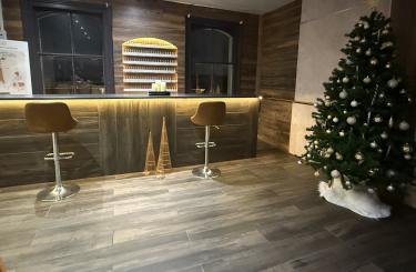
Why appearance still matters
We understand presentation in our industry better than most. We know lighting affects how our work looks. We know a messy workspace makes a client question hygiene.
Your website is exactly the same.
If your homepage looks chaotic or neglected, people subconsciously associate it with lack of care.
If it feels calm, clean, and intentional, they assume the same about your treatments and service.
It’s psychology.
Humans crave order and symmetry. Clean layouts, consistent fonts, and balanced colour palettes make our brains feel safe and comfortable, the same emotional state that encourages people to buy.
Colours matter too:
-
Blue tends to evoke trust and stability.
-
Green feels calm, natural, and balanced.
-
Black and white feel sleek and professional when used with restraint.
-
Overly bright or clashing colours can create tension and fatigue, pushing people away without them even realising why.
It’s not about design trends, it’s about emotional response.
Speed, layout, and flow matter just as much
We live in a world of instant decisions. 53% of users leave a site if it takes longer than three seconds to load (Google data).
If someone clicks your link and stares at a loading screen, they’ll likely go straight back to Google and click your competitor.
It’s not personal. It’s behavioural.
The same applies to confusing navigation.
If visitors can’t find your prices, location, or booking button in under 10 seconds, they’ll assume you’re difficult to work with and move on.
Design should guide the eye. Clear menu headings, consistent spacing, and visible contact details create flow and confidence.
Matching your image to the clients you want
You attract what you project.
If you want to appeal to higher-value clients who appreciate quality and professionalism, your online presence has to mirror that.
A potential client looking for a £150 advanced facial won’t book with a salon whose website looks ten years out of date. They’ll assume your treatments are too, even if they aren’t.
That’s why design isn’t vanity; it’s alignment.
Your website needs to feel like the service you deliver: modern, polished, and consistent.
Small changes that make a big difference
Here are a few simple things that can transform your site:
-
Simplify your homepage. One key message, one clear call to action, and well-lit, genuine imagery.
-
Improve your load time. Compress images and remove unnecessary animations or plugins.
-
Prioritise mobile design. Over 60% of web traffic now comes from mobile devices (Statista, 2025).
-
Be clear about what you do. If someone can’t tell within seconds, you’ve lost them.
-
Use your real photos. Authenticity builds connection — clients want to see you.
-
Keep colours and fonts consistent. It signals professionalism and attention to detail.
-
Avoid text-heavy blocks. Break content into short, easy paragraphs so people keep reading.
Why this matters to Google and AI too
Google tracks how long people stay on your site, how many pages they visit, and whether they come back.
If users leave quickly or struggle to navigate, it lowers your credibility score.
That’s why design, speed, and usability now play a direct role in SEO. A clean site tells both people and algorithms that you’re reliable and relevant.
In short: Google rewards good behaviour and so do clients.
Your website is your digital handshake
It’s your first impression, your credibility, and your silent salesperson all rolled into one.
The good news? You don’t need a fancy designer or big budget. You just need care, clarity, and consistency.
Your website should feel like the kind of experience you give in person, calm, confident, and professional.
That’s what builds trust. And trust is what gets you booked.


Login
Sign Up